A while ago I decided to give Citadel Contrast Paints a go. I understood the concept and watched the YouTube videos that explained how it all worked, and thought, I can do this. Well, things didn’t go quite as well as I thought they would. I tried various primers, white, light grey, the zenithal approach, but my first attempts were pretty awful. I have a few bases of village levy in my mid-15th century 28mm Burgundian army that are so bright, they can probably be seen outside on a moonless night. My first attempts in 40mm were on some medieval Irish and I managed to make these look better, but I still wasn’t that happy.
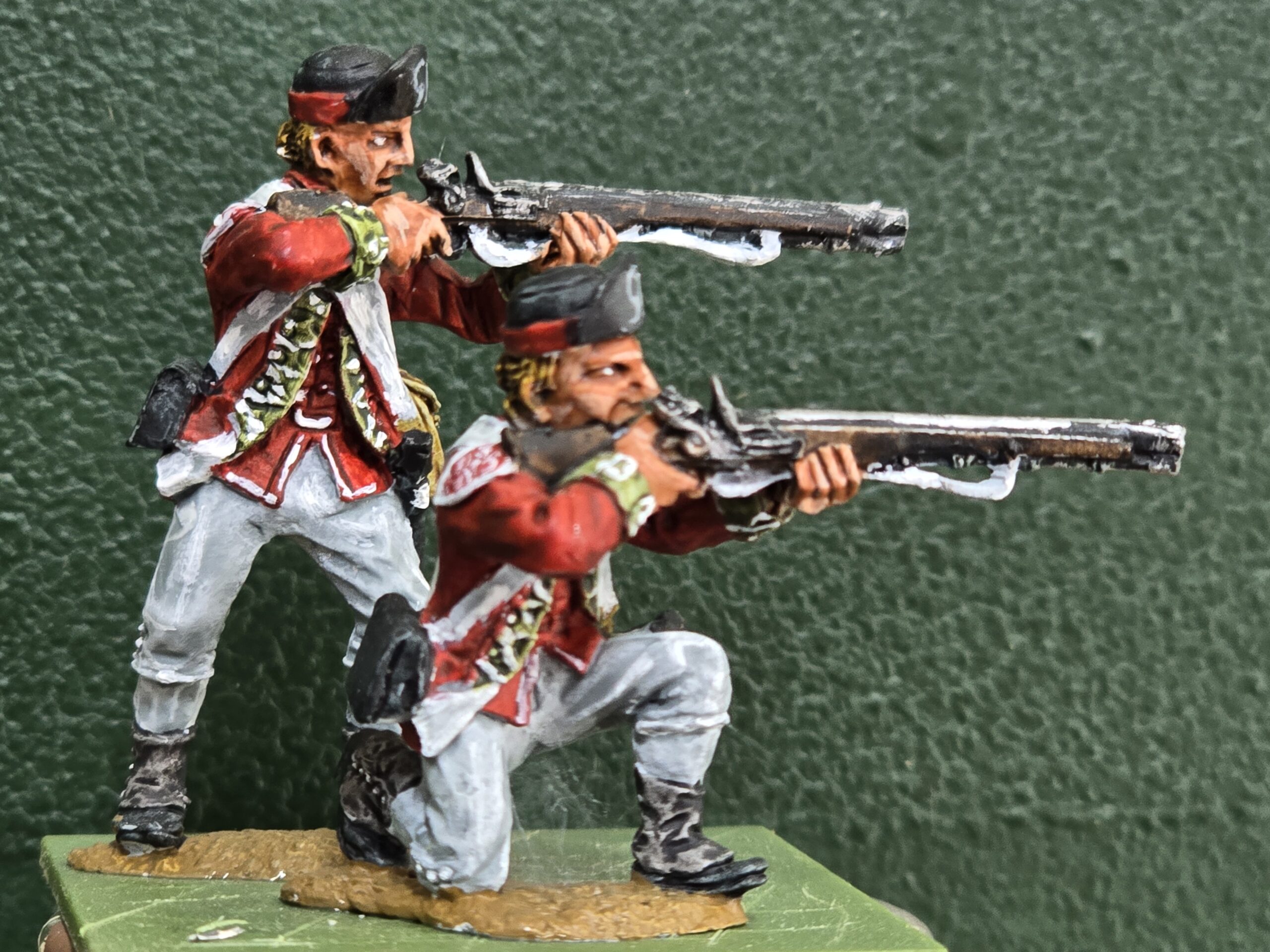
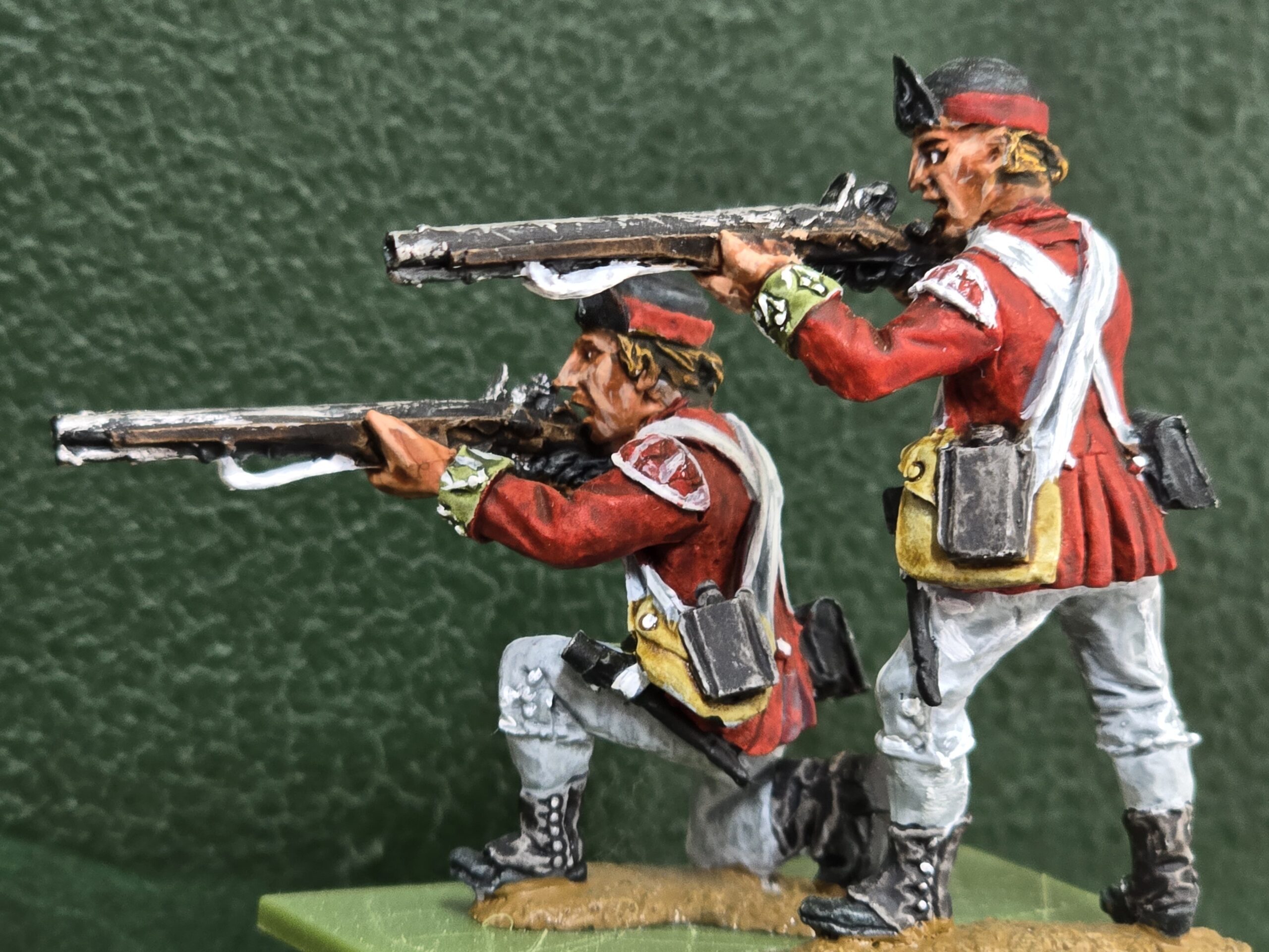
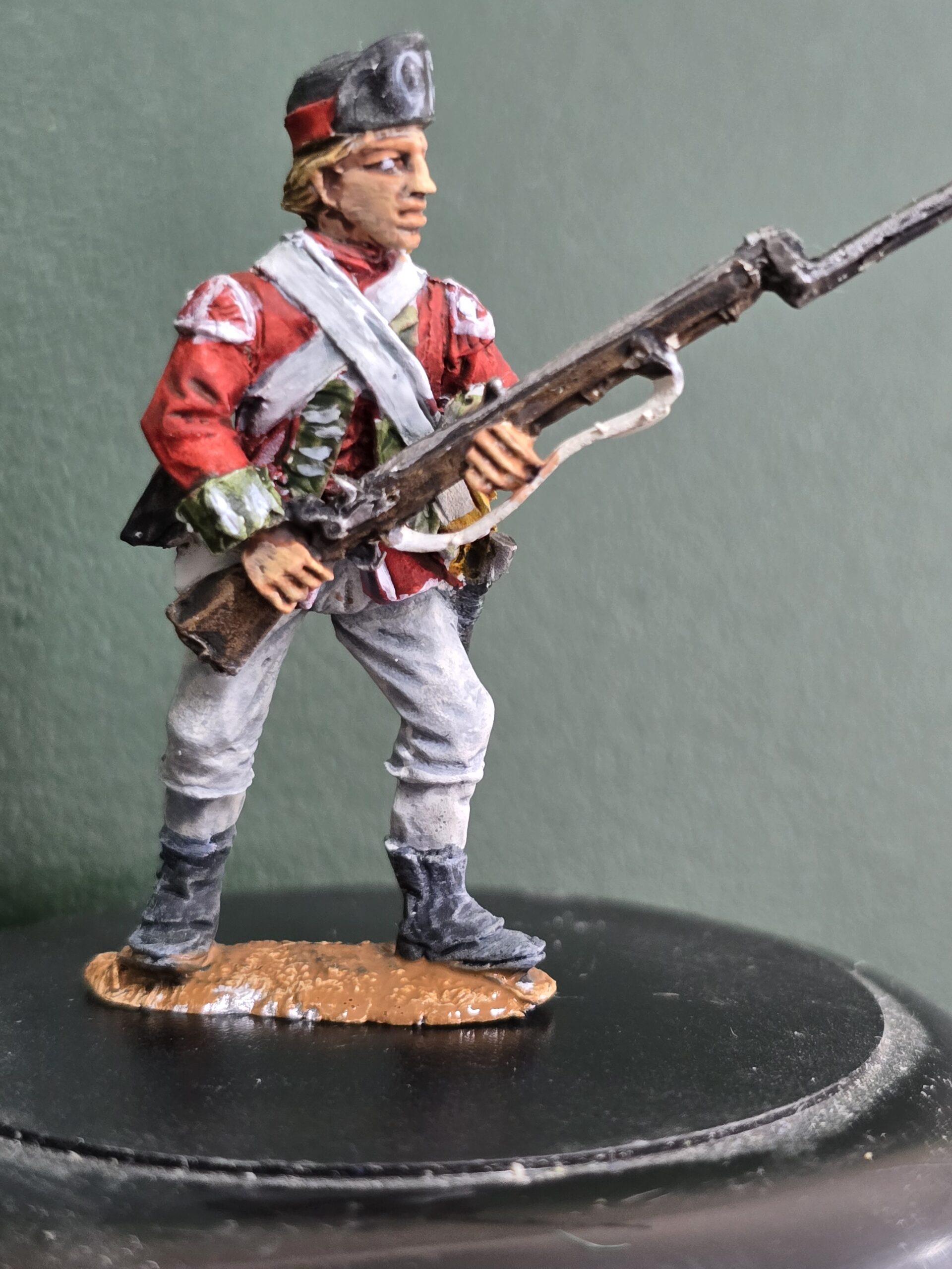
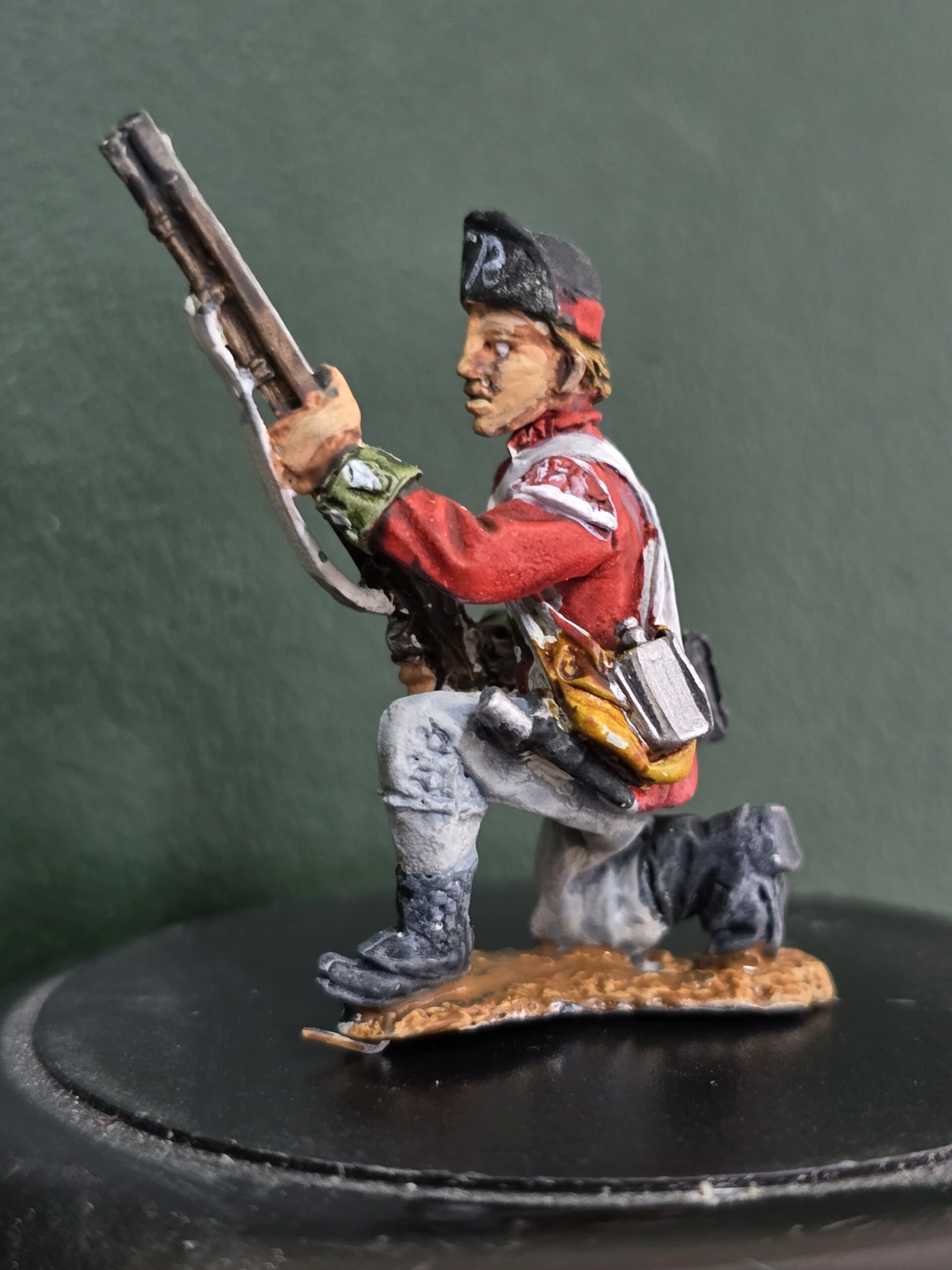
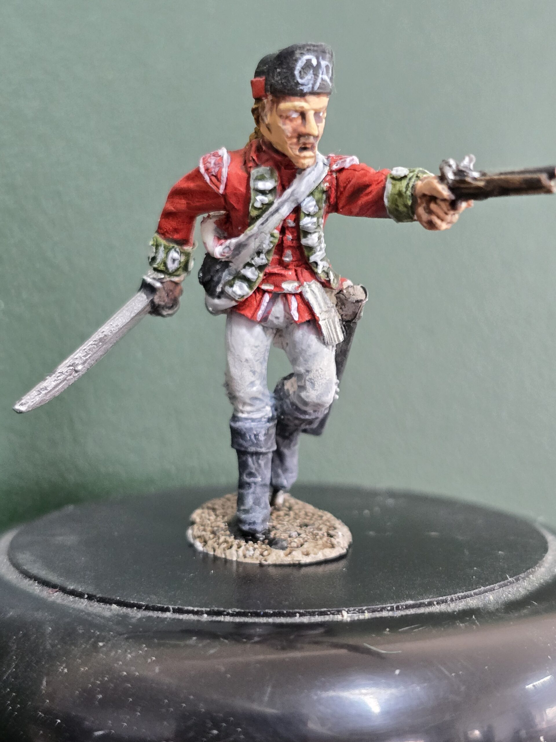
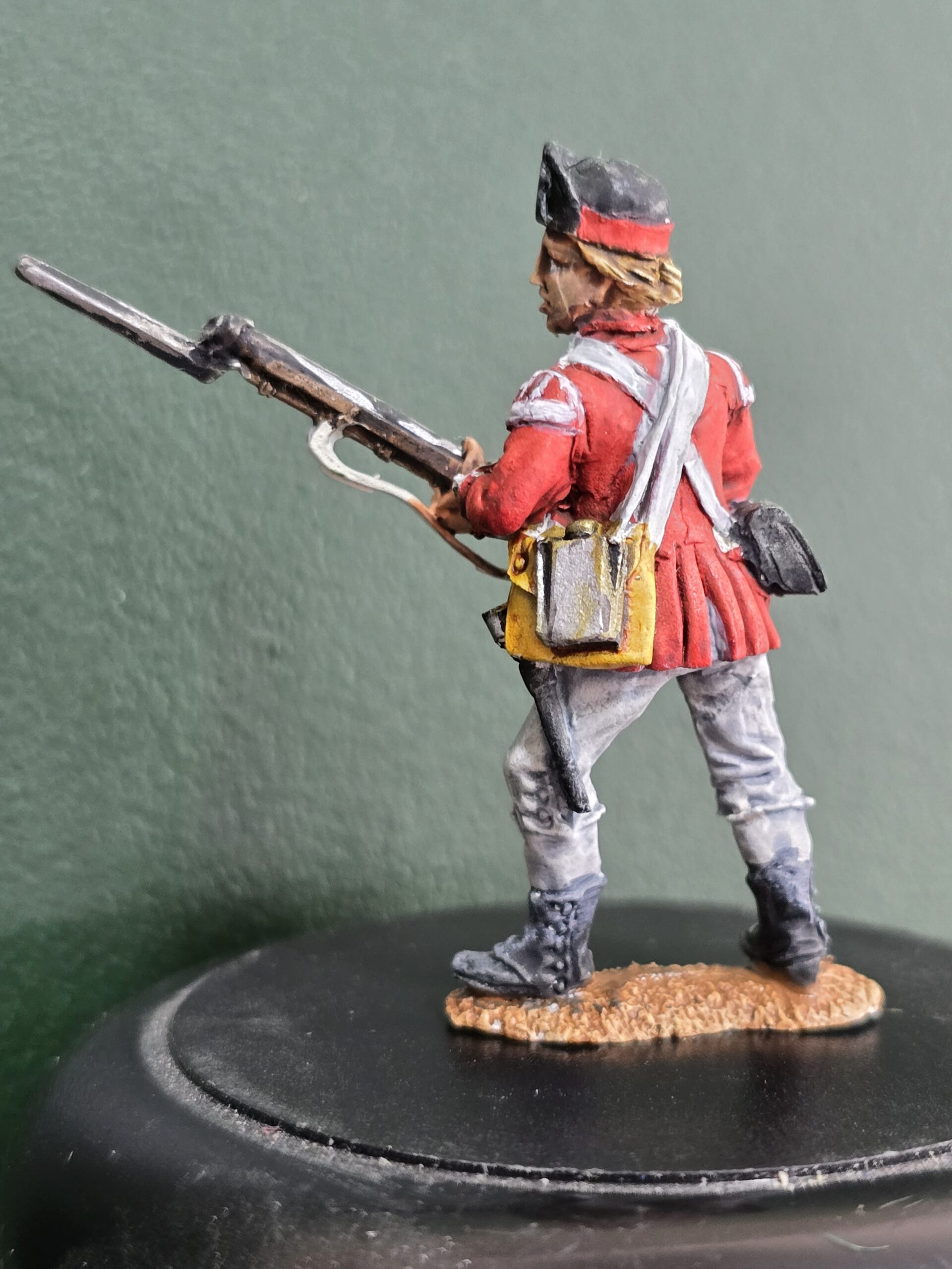
Fortunately, I had a friend to call. He has been using Contrast paints for a while and is getting good results. He volunteered to paint a sample and provide some progress pictures for me. He did look a little shocked when I turned up with a 12 figure unit pack of AWI British Light Infantry, as he was expecting to see only one figure! But I said, “pick one or two, paint them, and I will try and complete the rest of the unit following your progress pictures”. The examples he painted are at the top of this page. What follows are his progress pictures with some explanation and my results following his guidelines.
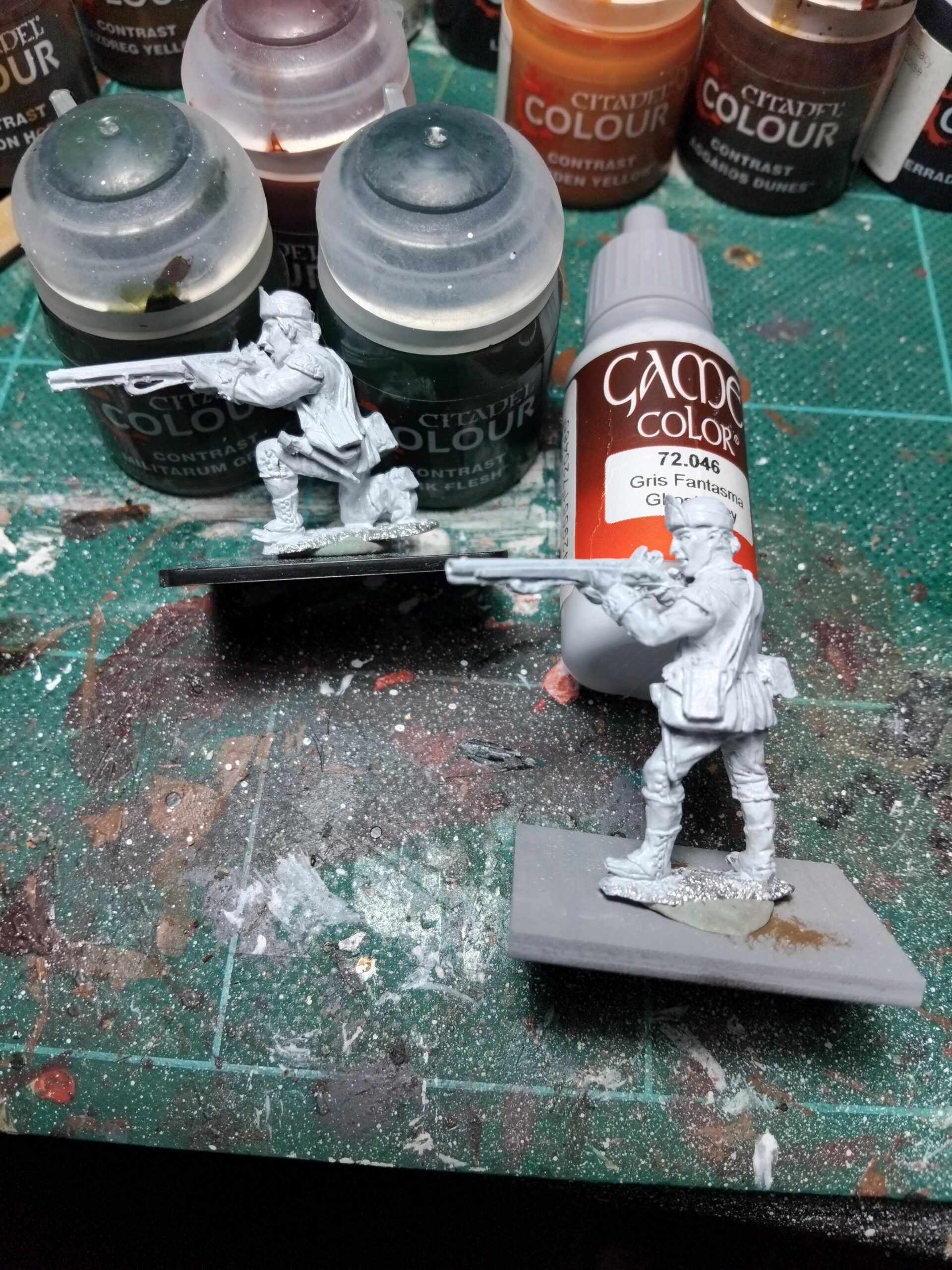
A pretty simple first step, is a good prime of plain white paint. I learned early, that the easiest way to achieve the outcomes Contrast paints are intended for, a white starter is paramount. And the second important lesson is, always paint between the lines! I have never been very good at that, but it is a must for these paints. Any base colour that is not white, will change the final appearance of any final colour that goes over the top.
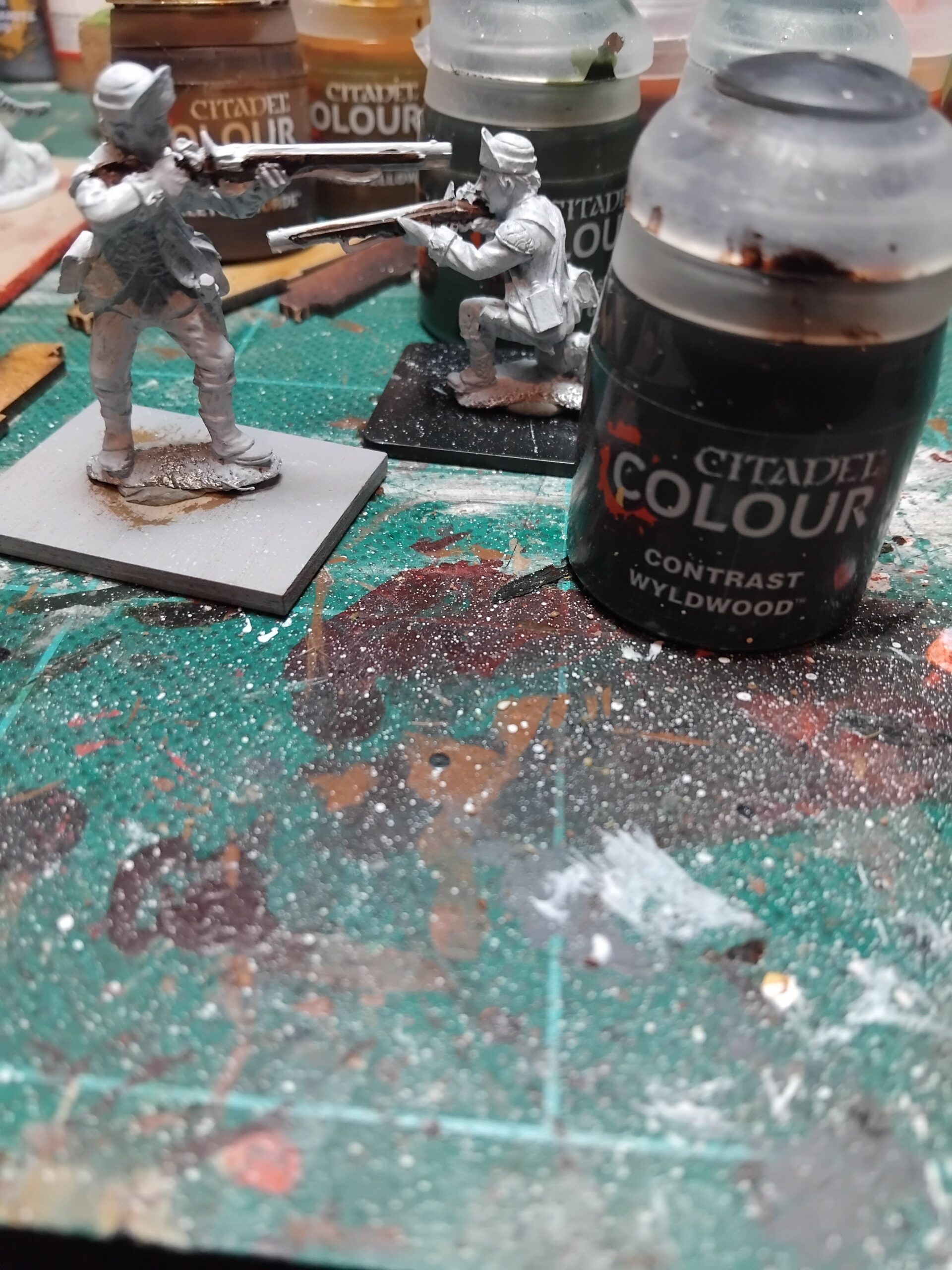 \
\Wyldwood was used to create the wood effects of the muskets the example figures have. This is the colour I used also, but there are a few suitable browns in the range that could be used. I found myself having to go back and tidy up the barrels and trigger parts of a few figures where the Wyldwood had got onto other parts of the muskets.
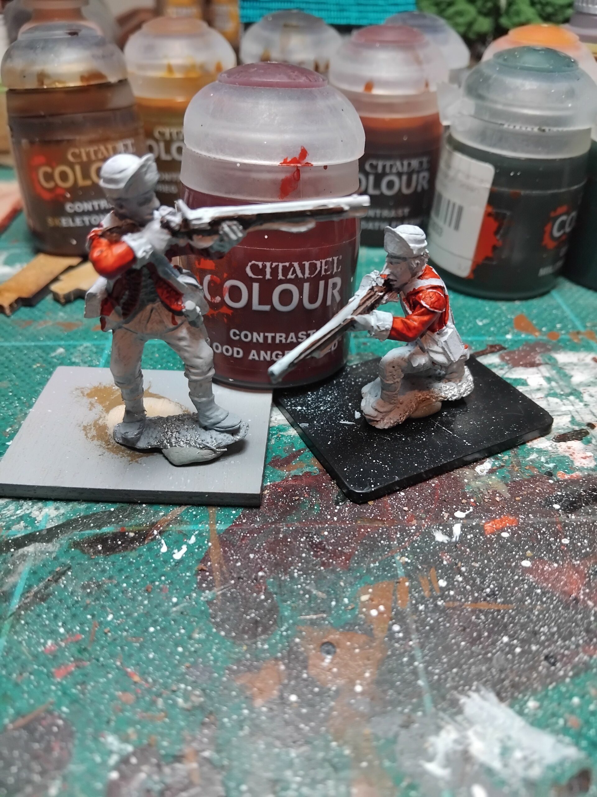
Blood Angels Red for the tunics. This was a nice colour to use. Painting larger areas of the figures with these paints you quickly get to see the potential they have, as the creases fill with paint and the base coat shows through where the highlights are. The lesson learned here though, is to have plenty of paint on your brush, but not too much, and, apply the paint in a consistent direction. I tried to paint downwards with each stroke of the brush and that generally worked ok. It can be easy to put on too much paint though; this can cause increased pooling in clothing creases or at the bottom of the part being painted. The paint dries slowly so it can be tidied up reasonably easily.
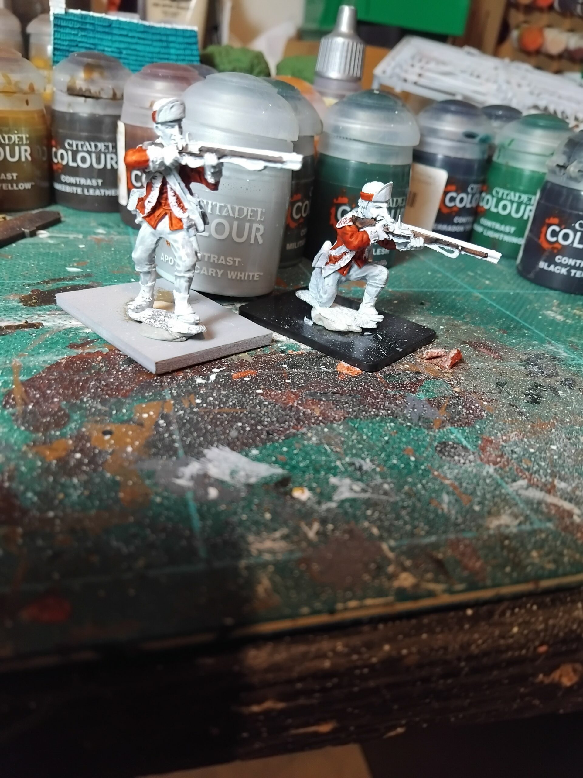
Apothecary White has been used for the trousers and any other white bits. I didn’t really like this colour as it is mainly grey, so you are adding shade to the existing base coat. I think it works ok on the finished figures most of the time, but I did find myself going back with a white acrylic and adding extra highlight where the Apothecary White was too grey.
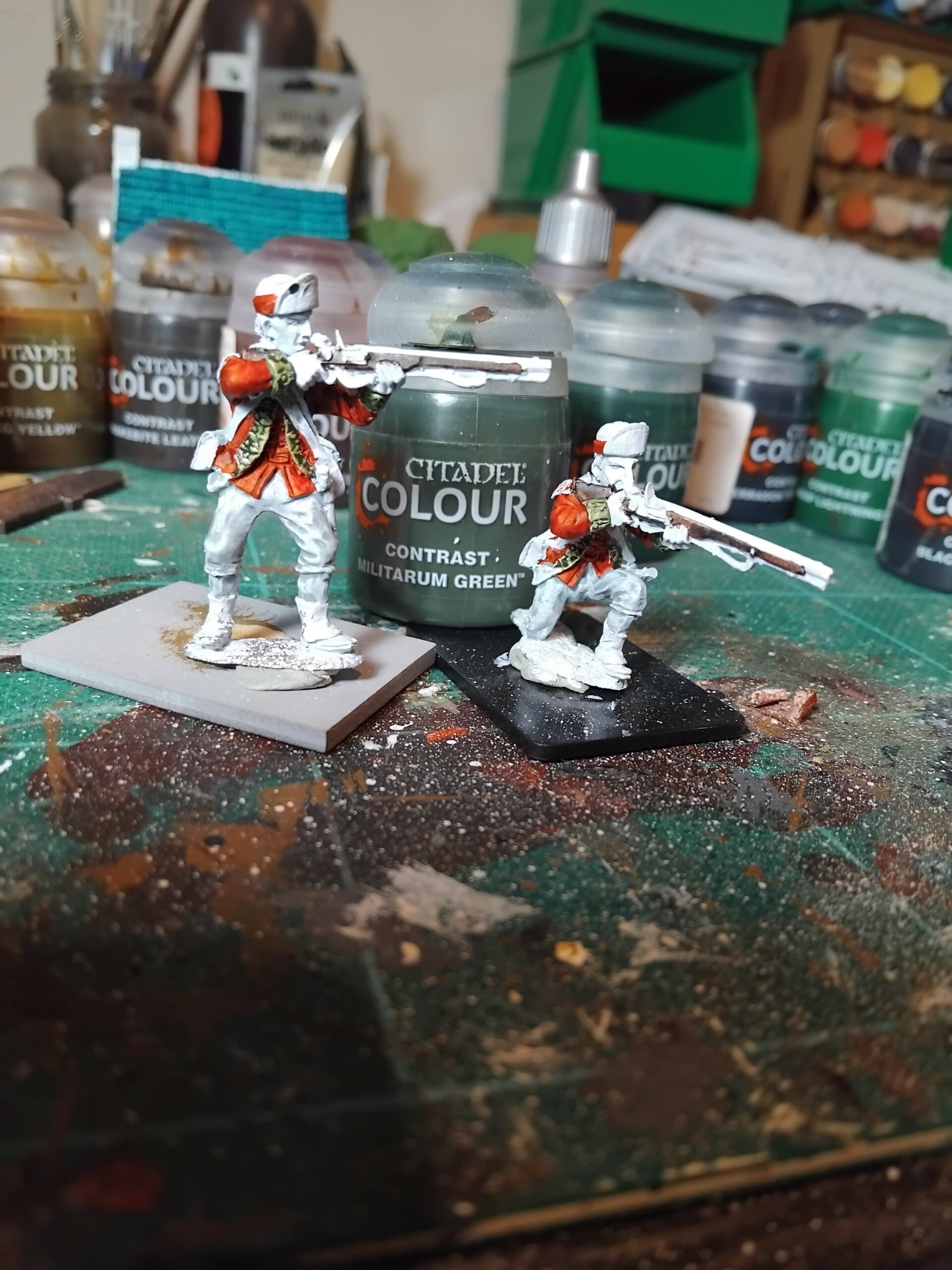
Militarun Green for the cuffs and front of the jackets. I just painted this on over the top of the button hole details, as I had already decided to go back and pick these out with an acrylic white. Probably easier that way.
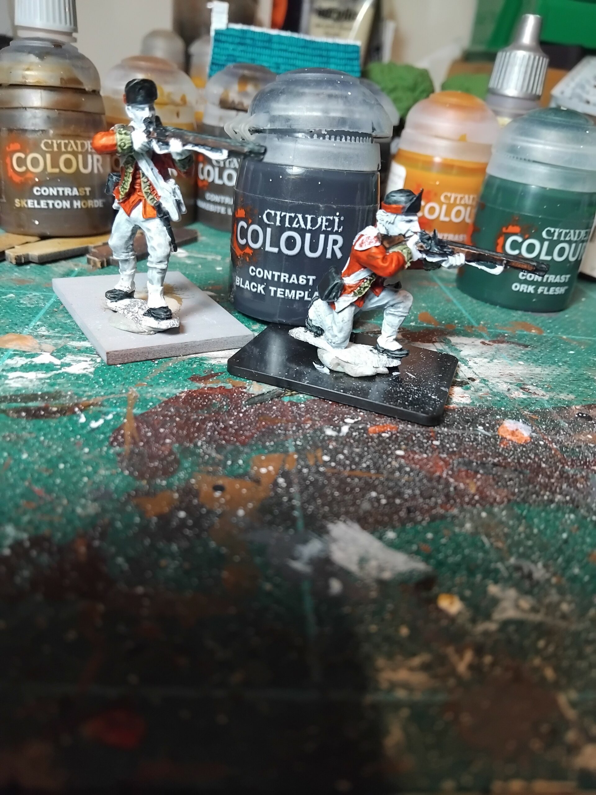
Black Templar for all the black parts of the uniforms. Hat, shoes, ammunition pouch, and, the metal parts of the musket. I also used a dark grey acrylic paint to add highlights to the black clothing items.
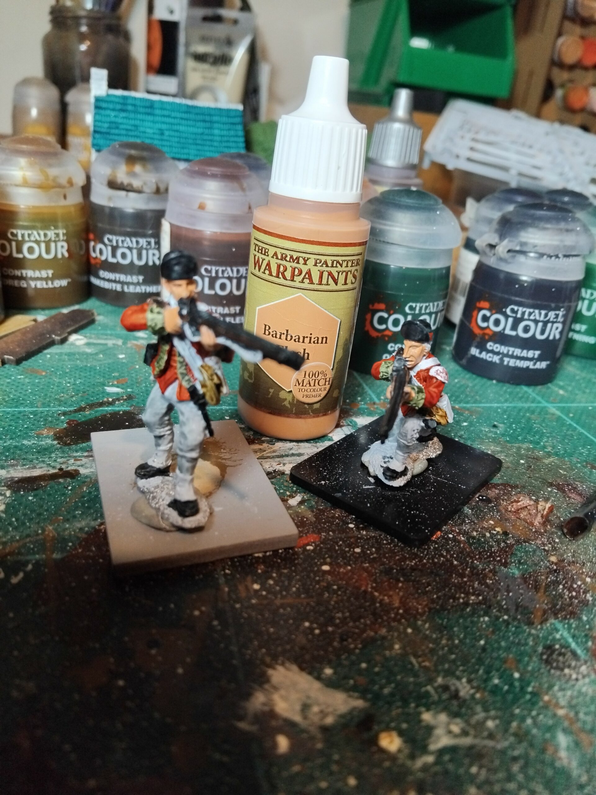
Barbarian Flesh for, unsurprisingly, the flesh parts. Any flesh colour or shade could be used here, the facial and hand details are picked out with a subsequent wash.
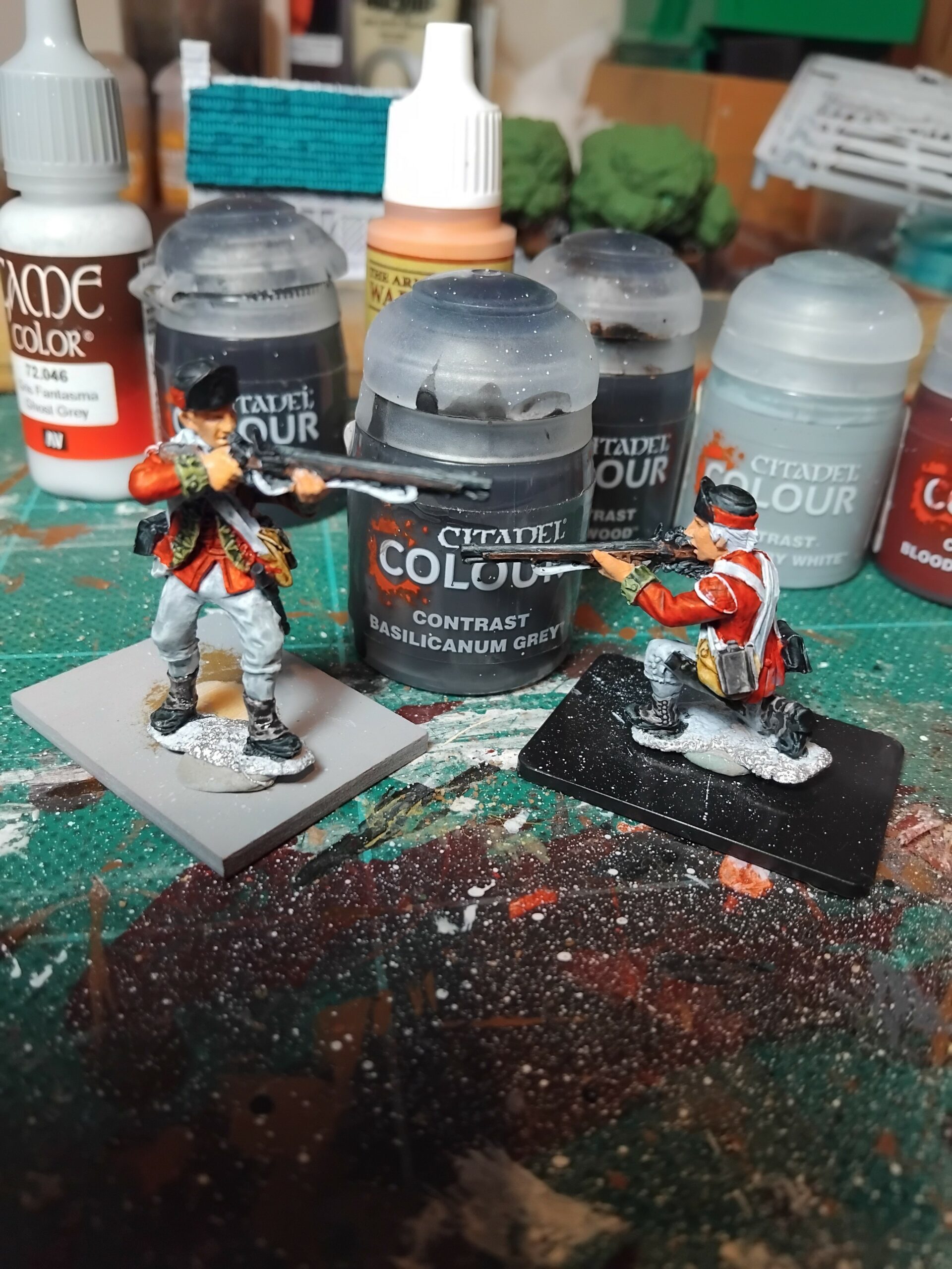
Basilicanum Grey for the metal parts previously painted black. On my figures I also highlighted those parts with an acrylic gunmetal. That just added a little bit more depth which I quite liked.
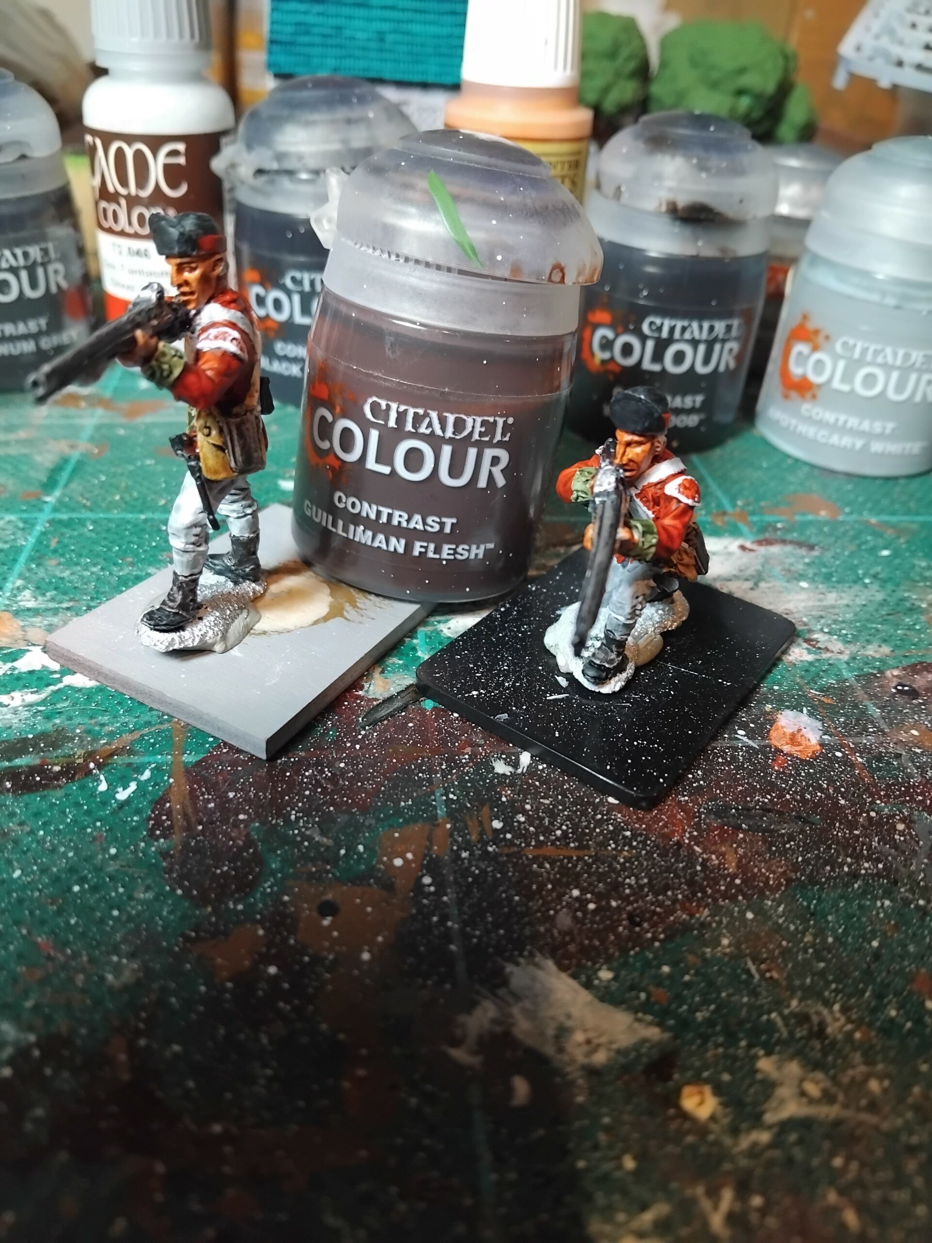
The wash for the hands and faces is Gulliman Flesh. I have also used a couple of Army Painter washes over a base flesh coat, and am currently using Flesh Wash. Changing the basic flesh paint and the washes can add a little bit of variety of skin tones, just for variety.
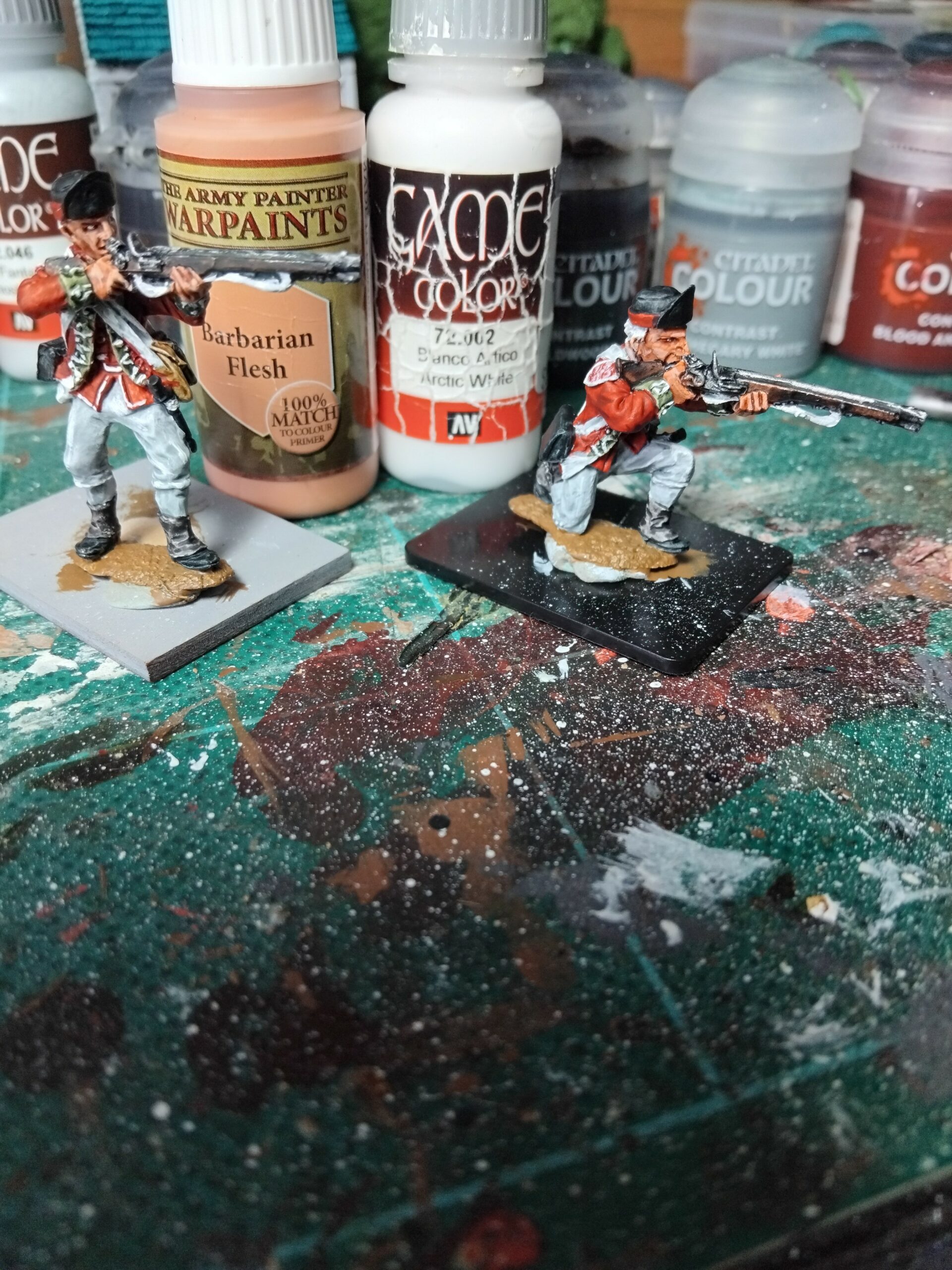
Last but not least, highlights for the flesh using a mix of Barbarian Flesh and white. At this stage, if your eyes and hands are steady enough, you can put in the eyeballs. I usually use an acrylic black with a fine brush, but have struggled so much to get the eyeballs in the right place, I have gone to using a black felt tip pen with a fine nib. That may be cheating, but it works.
Here are a few pictures of the figures I have painted following this method. I am reasonably happy with them, but there is an element of “not quite there” that I hope more practice will eventually bring. It will be clear that I have used some other colours on my figures not covered in the guideline pictures. These are all standard Vallejo acrylics and work well when picking out the smaller bits of detail.
The lessons I learned from this exercise –
- Paint between the lines! If you go over an area of the white base coat with a colour that is not the final colour for that part, you have to tidy it up. I found myself doing that a lot to start with; an acrylic white (or whatever your base colour is) is used to touch up those slip ups.
- The right amount of paint on the brush is important. If a colour, especially a dark one, gathers in a recess, it can get very dark, very quickly. Always watch out for this and remember Contrast paint takes longer to dry than other acrylics, so it remains “workable” for a little bit longer.
- There can be consistency issues with the consistency of some paints. Some come out almost as thick as a standard opaque acrylic. Diluting these with an acrylic medium seemed to work for me when this did occur.
- Applying a second coat of the same colour doesn’t always work. A second coat with some paints will make a significant change in some cases, a lot more than expected. Practice and patience.
There is a really good article in the first edition of Dice & Lead, the Dadi & Piombo online magazine, that talks about using Contrast colours. Most of my learnings were replicated there so at least I am not on my own learning these paints.
Next up, the new Seven Years War French.
Hey Phil, Very good job. At gaming distance they will look the part.
I’ve been using the contrast paints for awhile now. I like them but do agree with your take aways. I usually bounce around between the contrast and opague paints. I like to mix it up within a unit also, not making everybody look completely uniform.
Good article. I like these kinds of how to’s.
John
I have found myself using opaque paints to add detail and I think the mixture of the two works well.
Phil
Very nice, anything that saves time on an eighteenth century uniform is a winner!
I have been painting & selling figures for 40 years. Tried Contrast paints with poor tresults on multiple tries.takes to long for paints to dry. Will stick to my methods. Bob Moon , Jax, FL